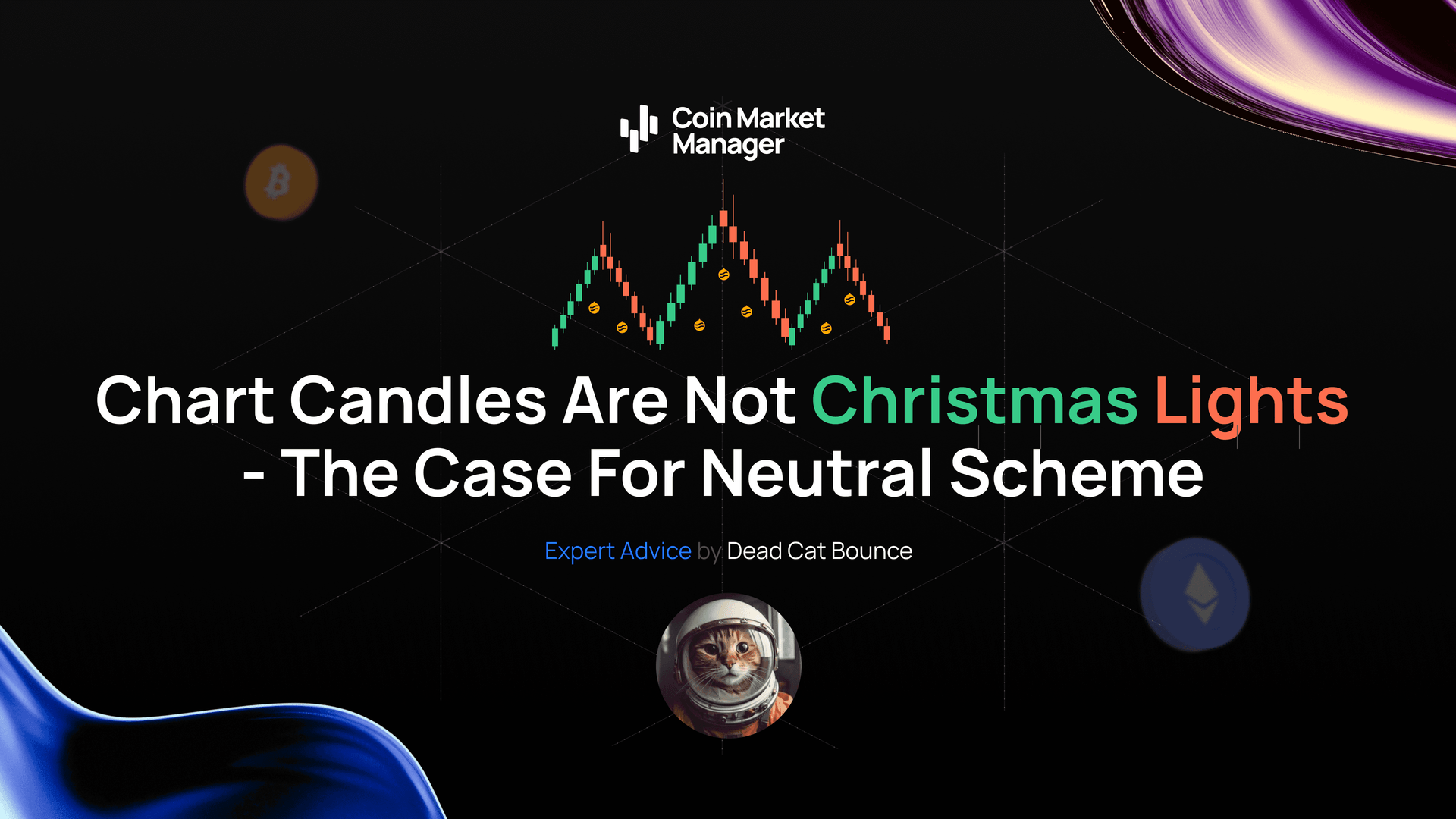
Chart Candles Are Not Christmas Lights
By Dead Cat Bounce - 21-Dec-2025
The Case for a Neutral Colour Scheme
It’s December. Candles are everywhere. Red for Santa, green for the Grinches.
On your trading chart, those same colours flash all day long, quietly messing with your head.
Green feels like a win.
Red feels like a loss.
Even when price action is completely neutral.
Most traders ignore a simple change that can materially improve decision-making: neutral candle colours. This isn’t about aesthetics. It’s about removing emotional bias baked directly into your chart.
Let’s break down why candle colours matter, how neutral schemes work, and why they help you trade with a clearer, calmer mind.

How Candle Colours Influence Trading Psychology
Candlestick charts use colour to convey direction:
Green → close above open
Red → close below open
Your brain processes this instantly. The problem is that colour isn’t neutral information. Years of conditioning associate green with good and red with bad: traffic lights, PnL dashboards, bank balances.
Behavioural finance research consistently shows that colour affects perception and decision-making. In trading, that bias shows up in predictable ways:
A run of green candles encourages premature longs, even into resistance
A string of red candles makes traders hesitate at strong support or chase impulsive shorts
The chart hasn’t changed. Your emotional response has.
That’s how objective analysis turns into reactive trading.
The Case for Neutral Candle Colours
Neutral candle schemes strip away emotional signalling. They present price movement without implying value judgement.
Common neutral setups include:
Light grey / dark grey (bullish vs bearish)
White / black (outline-based distinction)
Non-emotive colour pairs like blue/orange or purple/yellow
Monochrome charts where candles differ only by fill vs outline
When colour stops shouting, structure becomes clearer:
Wick length
Body size
Relative position
Context within the range
You stop feeling price and start reading it.
Practical Trading Benefits of Going Neutral
1. Reduced Bias in Ranging Markets
In chop, red/green exaggerates direction that isn’t there. Neutral colours keep the chart visually calm and help you focus on range boundaries instead of imaginary momentum.
2. Clearer Pattern Recognition
Without emotional colour cues, candlestick patterns stand out through shape and placement, not psychological suggestion.
3. Lower Emotional Load
Fewer fear responses during red runs. Less greed during green streaks. That directly reduces FOMO entries and revenge trades.
Implementation Is Trivially Easy
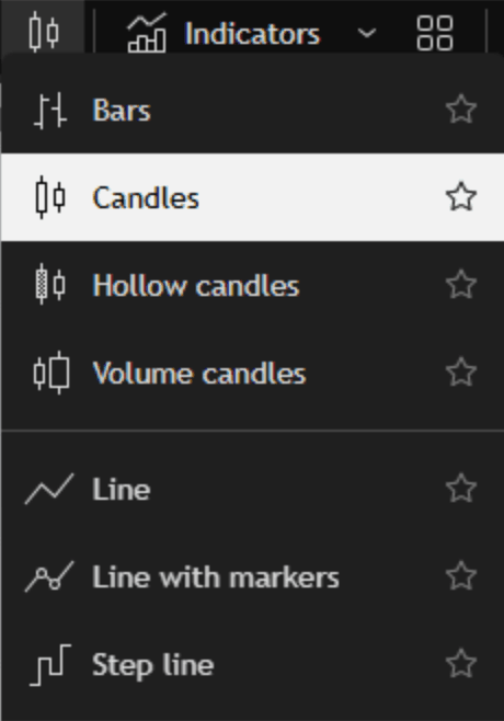
On TradingView, switching candle styles or colours is a one-click change. You can also go further:
Hollow candles
Volume candles
Or even a simple line chart to remove candle bias entirely
If a minor visual tweak can reduce emotional noise, there’s no excuse not to test it.
Final Thoughts... and a Task
Candles are not Christmas lights.
They shouldn’t reward you emotionally or punish you psychologically.
Neutral colours let you see price action for what it is — not what your brain wants it to feel like.
Task:
Trade one week using standard red/green candles.
Trade the following week using a neutral or monochrome scheme.
Log:
Emotional reactions
Entry quality
Exit discipline
Win-rate
Track it properly in your CoinMarketMan journal and compare results.
If your trading improves, you’ve just removed one of the quietest sources of bias on your chart.

— DeadCatBounce