
Why Strong Assets Win, and How to Find Them
By Dead Cat Bounce - 10-Jun-2025
Strength attracts buyers.
If you’re spending time chasing laggards or trying to bottom-pick weak assets, you’re giving up your edge. One of the most consistent trading advantages is simple: be in the strongest sector, holding the strongest asset.
In this post, I’ll break down:
- Why relative strength matters
- How to visually compare assets (yes, including the trusty spaghetti chart)
- And how to use that info to stay on the right side of momentum
Why Relative Strength Matters
Relative strength is about identifying assets outperforming others in the same sector or market. And here’s the key insight: strong assets tend to stay strong. It’s a version of Newton’s first law applied to markets — things in motion usually keep moving… until something major shifts.
📈 In a crypto bull run, would you rather be long BTC while it’s ripping past $100K, or stuck holding an altcoin that’s done nothing for three months?
Trading is a game of efficiency. Your capital isn’t infinite — treat it like a team of elite soldiers. You want them deployed where there’s momentum, not sitting in deadweight. You can always rotate back into underperformers once they show signs of life.
How to Spot Relative Strength
This isn’t guesswork. Strong vs. weak assets is a data-backed decision. Here are the three ways I track it:
1. The Spaghetti Chart
This is my favourite visual tool for comparing assets side by side. A spaghetti chart is just a percentage-change line chart, where multiple assets are normalised from the same starting point. It quickly shows who’s outperforming.
🟠 The higher the line, the stronger the asset.
🔵 The lower the line, the weaker it’s been.
For example:
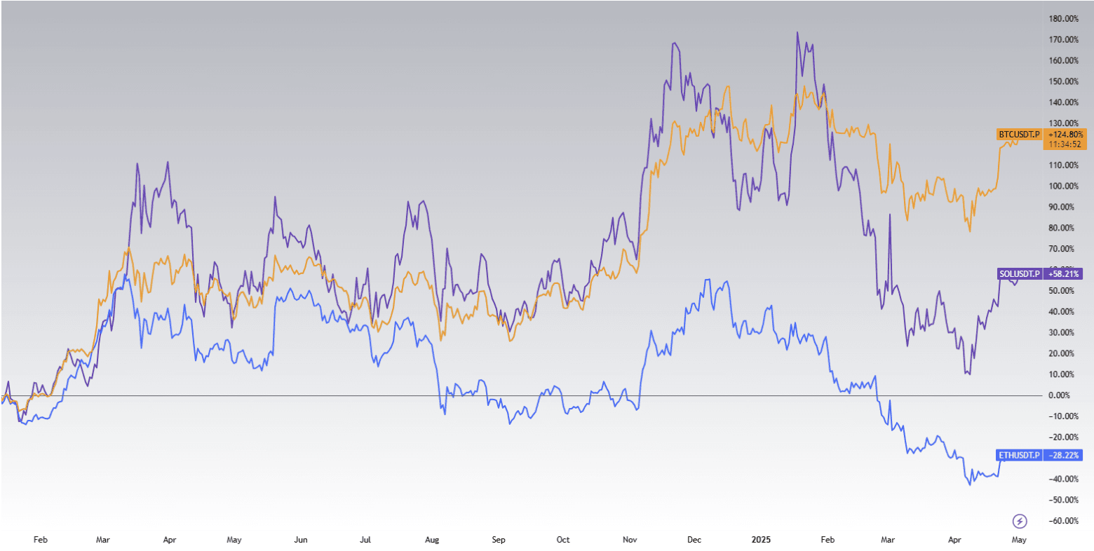
Spaghetti chart comparison for BTC, ETH, and SOL since January 2024.
From the chart above, BTC has outpaced both SOL and ETH over the past year. ETH, meanwhile, is clearly lagging — down over 28% while BTC is up 124%. That’s a signal worth paying attention to.
You can build your own spaghetti charts using platforms like TradingView by plotting % changes over time.
2. Sector Performance
Zooming out further — it's not just about individual coins or stocks. It’s also about which sectors are in favour. If AI tokens are heating up and meme coins are dragging, it makes more sense to search for setups within the AI sector.
Traders often get stuck longing the same asset over and over, ignoring broader momentum shifts. Don’t do that. Scan sector performance using tools like CoinGecko or Messari sector filters.
3. Moving Averages
Sometimes the simplest tools are the best. Moving averages (MAs) are a reliable way to spot strength shifts.
I like the EMA 21 and EMA 50, but many traders use EMA 9, 20, or 50 depending on timeframe. Here’s what to watch for:
✅ Strong assets are reclaiming multiple MAs
🚩 Weak ones are still struggling beneath them
When price gets back above these lines, especially after a prolonged dip, that’s usually the first sign of renewed strength.
Weak Assets Are a Trap ⚠️
Let’s be honest — we’ve all stared at a chart thinking it’s “finally bottomed,” only to watch it go sideways for another 100 days.
If an asset has no momentum, there’s a reason. Either no one wants it… or there's just as much selling pressure as buying interest.
The most painful trades are the ones where you called the move but picked the wrong asset. Don’t be the hero trying to catch every bottom.
Final Thoughts: Stack Probabilities, Not Hopes
Strong assets win because buyers are already there. Your job isn’t to find the miracle turnaround play — it’s to maximize edge and reduce waiting time.
Relative strength is one of the cleanest ways to do that.
Don’t fight the trend
Don’t waste capital on flatlines
Don’t marry a loser
Follow strength. Let momentum do the heavy lifting.
