Five Minutes of Order Flow Is All You Need on Hyperliquid
By CMM Team - 01-Sep-2026
Five Minutes of Order Flow Is All You Need on Hyperliquid
Most traders stare at candlestick charts and think they're watching the market. They're watching a summary of what already happened. Candles compress all the buying, selling, liquidations, and stop triggers within a time window into four numbers: open, high, low, close. The story behind the move disappears.
Order flow data tells that story. And on Hyperliquid, where every trade settles on-chain with full transparency, rolling 5-minute order flow snapshots give you something candlesticks never will: a look at who is moving the market, how aggressively they're doing it, and whether the people taking the other side have historically been right or wrong.
This article breaks down what a 5-minute snapshot contains, how to layer in cohort context for richer signals, and why sequences of snapshots matter more than any single data point.
What a Candlestick Hides
A green candle tells you the close was higher than the open. It says nothing about how it got there. Maybe a single Leviathan wallet (perp equity above $5M) opened a massive long in the first 30 seconds, and the rest of the candle was just smaller participants reacting to the move. Maybe the candle was green because a cascade of short liquidations forced covering, and the organic buying behind it was actually weak.
Both scenarios produce an identical candle. They carry completely different implications for what happens next.
Order flow data disambiguates these scenarios because it separates the underlying components: buy volume vs. sell volume, taker aggression, liquidation activity, and the behavioral profile of the wallets driving each side. On a centralized exchange, most of this data is hidden behind matching engines. On Hyperliquid, it's all on-chain, which means anyone with the right infrastructure can decompose every candle into its constituent parts.
The challenge is that raw on-chain data is firehose-level noise. Parsing it, classifying wallets, and computing meaningful aggregates in real time requires serious infrastructure. That's where pre-computed snapshots come in.
Anatomy of a Rolling 5-Minute Snapshot
HyperTracker captures order flow in rolling 5-minute windows. Each snapshot is a self-contained picture of market activity for a specific asset during that window. Here's what lands in a single snapshot:
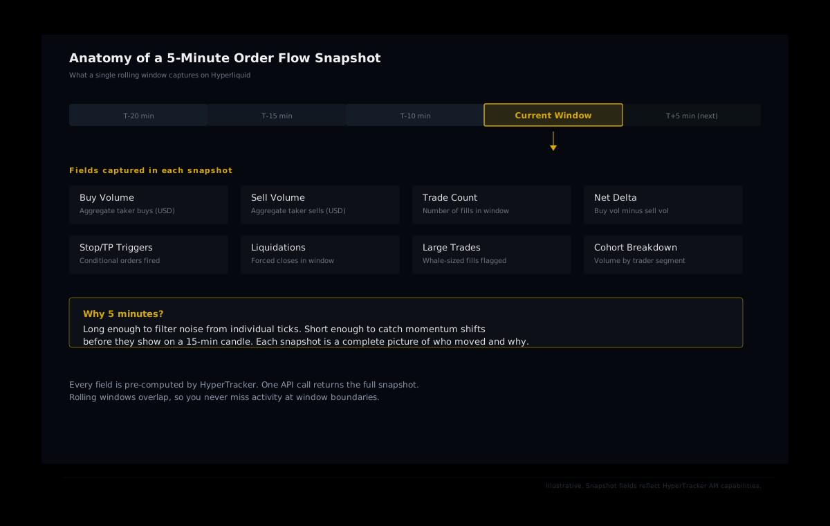
- Buy and sell volume: Aggregate taker buying and selling in USD terms. This is the raw fuel of price movement.
- Net delta: Buy volume minus sell volume. Positive delta means takers are net buying; negative means net selling. Simple, but powerful when tracked over time.
- Trade count: How many fills occurred. A high trade count with low net delta means balanced two-sided flow. A low trade count with high delta means a few large participants are driving the move.
- Stop and take-profit triggers: Conditional orders that fired during the window. A spike in stop triggers after a price drop is a liquidation cascade signal.
- Liquidation events: Forced position closures within the window. Liquidations are not voluntary trades. They're the market's cleanup crew, and they often amplify moves.
- Cohort-level breakdown: All of the above, sliced by HyperTracker's 16 behavioral cohorts. You don't just see that there was $2M in taker buying. You see which segments are behind it.
Why 5 minutes?
The window size is a deliberate tradeoff. Tick-by-tick data is noisy: individual trades carry almost no signal by themselves because a single large fill can create a misleading spike. On the other end, 15-minute or hourly aggregates smooth out too much. By the time an hourly snapshot shows a shift, the move is already on the chart.
Five minutes is the sweet spot where noise gets filtered and signals stay actionable. It's long enough to establish whether flow is sustained or one-off, and short enough to catch momentum shifts before they're visible on a standard candle chart.
Adding Cohort Context to Raw Flow
Net delta alone is a blunt instrument. Knowing that $3M in net buying happened in the last 5 minutes is useful, but knowing who is behind that buying changes the interpretation entirely.
HyperTracker classifies every active wallet on Hyperliquid into one of 16 behavioral cohorts. Eight cohorts are based on wallet size (perp equity), ranging from Shrimp ($0-$250) to Leviathan ($5M+). Eight are based on all-time PnL, ranging from Giga-Rekt (below -$1M lifetime) to Money Printer (+$1M lifetime). Every order flow snapshot includes cohort-level breakdowns, so you can see which segments are driving each side of the market.
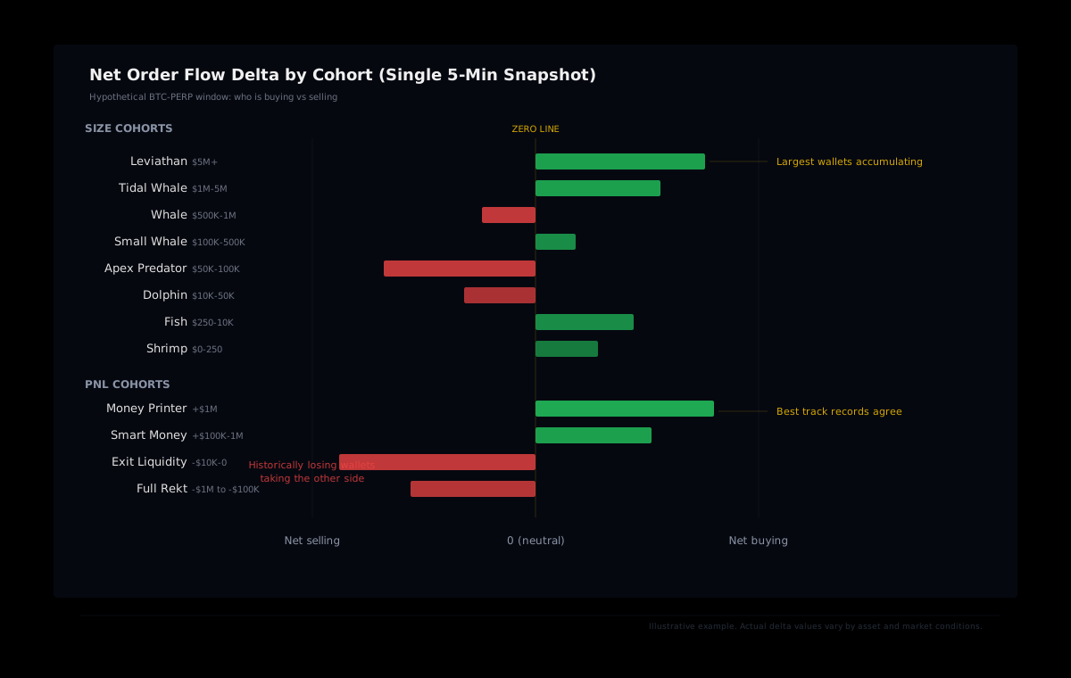
Consider a scenario where net delta is positive. Candle traders see a green bar and move on. But the cohort breakdown might show that Money Printer and Leviathan wallets are accumulating while Exit Liquidity and Full Rekt wallets are selling into them. That's a divergence worth paying attention to, because it means the wallets with the best historical track records are on one side, and the wallets with the worst track records are on the other.
The reverse is equally informative. If Exit Liquidity wallets are buying aggressively while Money Printers are reducing exposure, the positive delta might be a trap. The overall flow looks bullish, but the participants driving it have historically been wrong.
Key distinction: HyperTracker classifies wallets into cohorts based on size and all-time PnL. The cohort labels describe historical behavior. They do not predict future performance, and past PnL does not guarantee future results.
Why Snapshot Sequences Beat Single Data Points
A single 5-minute snapshot is a data point. It tells you what happened in one window. But markets move through phases, and the real signal comes from tracking how flow evolves across consecutive windows.
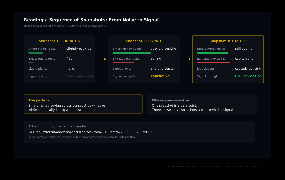
Three consecutive snapshots where Smart Money cohorts are net buying and Exit Liquidity cohorts are net selling carry more weight than a single window with the same pattern. Repetition across windows filters out the noise of random individual trades and surfaces sustained intent.
Here's a practical framework for reading sequences:
- Confirmation: Look for the same directional bias across two or more consecutive snapshots. A single window of heavy buying could be a whale entering and exiting within minutes. Two or three windows of sustained buying suggest deliberate accumulation.
- Divergence: Watch for the moment when cohort-level flow diverges from aggregate flow. If total delta flips positive but Money Printer wallets remain flat or are reducing, the move may lack conviction from the most experienced participants.
- Liquidation escalation: Track whether liquidation counts increase across consecutive snapshots. A rising trend in forced closures means the move is being amplified by margin calls. These cascades tend to overshoot, which creates opportunities once the forced selling exhausts itself.
- Flow exhaustion: Monitor when strong directional delta starts declining window-over-window even though price hasn't reversed. Declining flow at sustained price levels often precedes a reversal because the buying or selling pressure that drove the move is fading.
Querying Snapshots Through the API
HyperTracker exposes order flow snapshots through a REST endpoint. A single call returns the full snapshot array for a given asset:
GET /api/external/orderSnapshotsForCoin?coin=BTC&start=2026-09-07T12:00:00.000Z

Authorization: Bearer YOUR_JWT_TOKEN
The start parameter must be ISO 8601 format. The response includes an array of snapshot objects, each covering a 5-minute window. You can iterate through consecutive entries to build the sequence analysis described above.
For builders integrating this into a dashboard or bot, the pattern is straightforward: poll the endpoint every 5 minutes, compare the latest snapshot to the previous one, and trigger alerts when specific conditions are met. An example condition might be: "Smart Money cohort net delta positive in three consecutive windows while aggregate liquidation count is rising."
Builder tip: The
orderSnapshotsForCoinendpoint returns multiple snapshots per call. Batch your queries rather than requesting one window at a time. This keeps you well within API rate limits and reduces latency in your pipeline.
Combining snapshots with position data
Order flow snapshots tell you what's happening right now. Position endpoints (/positions/coin, /positions/stats) tell you how the market is already positioned. The two together create a richer picture: current flow layered on top of existing positioning.
If a cohort is already heavily long and their snapshot delta turns negative, it could signal profit-taking or a shift in conviction. If a cohort is lightly positioned and their snapshot delta spikes, it could signal fresh entries. Neither data source alone gives you that context.
Common Misreads (And How to Avoid Them)
Order flow data is powerful, but it's easy to misinterpret. Here are the patterns that trip up traders who are new to snapshot analysis:
Mistaking a single large fill for a trend
One whale opening a position in a quiet market can dominate an entire 5-minute window. The snapshot will show extreme delta, but it's a one-off event. Always check trade count alongside delta. A high delta with a low trade count is a single participant, which carries less predictive weight than the same delta spread across dozens of fills.
Ignoring the liquidation component
Liquidations are forced trades, and they amplify moves in ways that organic flow does not. A snapshot showing heavy buying might look bullish until you realize most of that "buying" is actually short liquidations. The distinction matters because liquidation-driven moves tend to reverse once the forced activity stops.
Overweighting a single cohort
It's tempting to build a strategy that only tracks Money Printer wallets and ignores everything else. But cohort labels describe historical performance, and smart money in aggregate can be wrong on individual trades. Use cohort divergence as one input among several. The strongest signals come when multiple independent indicators align: sustained delta, cohort agreement, and liquidation dynamics all pointing in the same direction.
Reading too much into low-volume periods
During quiet hours (early mornings in UTC, weekends for traditional asset perps), snapshot data gets thin. A small number of trades can produce dramatic-looking deltas that mean very little. Consider total trade count and USD volume as a filter before drawing conclusions from cohort breakdowns.
From Snapshots to Edge
The entire point of order flow analysis is to see what candlestick charts compress away. Rolling 5-minute snapshots on Hyperliquid give you a structured, API-accessible window into that data. Layer in cohort context and you move from "there was net buying" to "Money Printers are accumulating while Exit Liquidity wallets sell into them." Track sequences across consecutive windows and you separate one-off noise from sustained conviction.
None of this is a crystal ball. Markets are noisy, and even the best-performing cohorts get trades wrong. But having the raw data, pre-computed and classified, lets you ask better questions. And in trading, better questions compound into better decisions over time.
Start querying order flow snapshots
HyperTracker's API gives you rolling 5-minute order flow snapshots with full cohort breakdowns. One call. 16 behavioral segments. Pre-computed and ready to build on.
Five minutes of data. Sixteen cohorts of context. That's the layer between staring at candles and understanding what's actually happening on Hyperliquid.