
Hyperliquid OI Is Back to Pre-Crash Levels. The Cohorts Tell a Different Story.
By CMM Team - 09-Sep-2026
Hyperliquid OI Is Back to Pre-Crash Levels. The Cohorts Tell a Different Story.
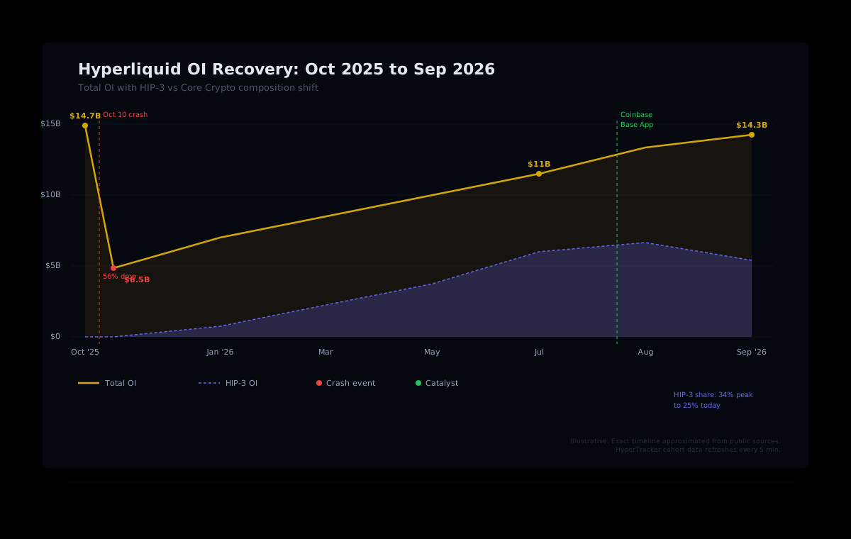
Hyperliquid's open interest just crossed $14.3 billion. On paper, that puts the platform within striking distance of its $14.7 billion pre-crash peak from October 2025. The headline number looks like a full recovery, which is exactly why it's dangerous to trade on headlines alone.
The aggregate OI figure hides a structural shift underneath. The composition of who is positioning, how leverage is distributed across trader cohorts, and which market segments are driving the growth has changed dramatically since the crash. Cohort-level data reveals patterns that the top-line number obscures, and those patterns matter for anyone sizing risk or building trading systems on Hyperliquid.
This article breaks down the OI recovery through a cohort lens, examines the catalysts behind the surge, and shows how behavioral segmentation reveals what a single aggregate number cannot.
The Recovery Timeline: $6.5B to $14.3B
On October 10, 2025, Hyperliquid's open interest collapsed by roughly 56% in a single day, falling from $14.7 billion to $6.5 billion. The liquidation cascade wiped out $10.3 billion in positions on Hyperliquid alone, destroying $1.23 billion in trader equity and eliminating 6,300 wallets entirely.
The platform survived through its backstop mechanism, which absorbed roughly $576 million of forced sales off the public order book during peak panic. It kept 100% uptime, processed zero bad debt, and began its slow climb back.
The recovery played out in two distinct phases. From March through August 2026, HIP-3 (builder-deployed perpetuals covering real-world assets, pre-IPO names, and prediction markets) drove the first leg. By August, HIP-3 accounted for over $4 billion in open interest and represented roughly half of total platform volume.
Then something shifted. Over the past month, total OI rose by roughly $3.57 billion, but HIP-3 OI actually fell by $119 million. The second phase of the recovery is being driven by core crypto perpetuals, particularly BTC and ETH. That shift in composition matters enormously when you're analyzing trader behavior.
Why the Same Number Means Something Different
Consider two scenarios. In October 2025, $14.7 billion in OI was concentrated heavily in crypto perpetuals, with crowded long positioning across major pairs. Retail leverage was elevated, and the market was structurally fragile. When the cascade hit, 87% of forced selling came from long positions.
Today's $14.3 billion has a fundamentally different composition. HIP-3 markets (real-world assets like oil, gold, Nasdaq trackers, and pre-IPO names like SpaceX) now account for a substantial share. These markets attract a different trader profile: more institutional, lower leverage, longer holding periods. A dollar of OI in a crude oil perpetual behaves differently from a dollar in a leveraged BTC long during a euphoric altseason.
This is precisely where aggregate metrics fail. Without segmenting by trader behavior, you cannot distinguish between healthy growth (institutional capital flowing into diversified markets) and fragile growth (retail leverage stacking into one-directional bets). The top-line number is identical. The risk underneath is not.
How Cohort Data Exposes the Real Structure
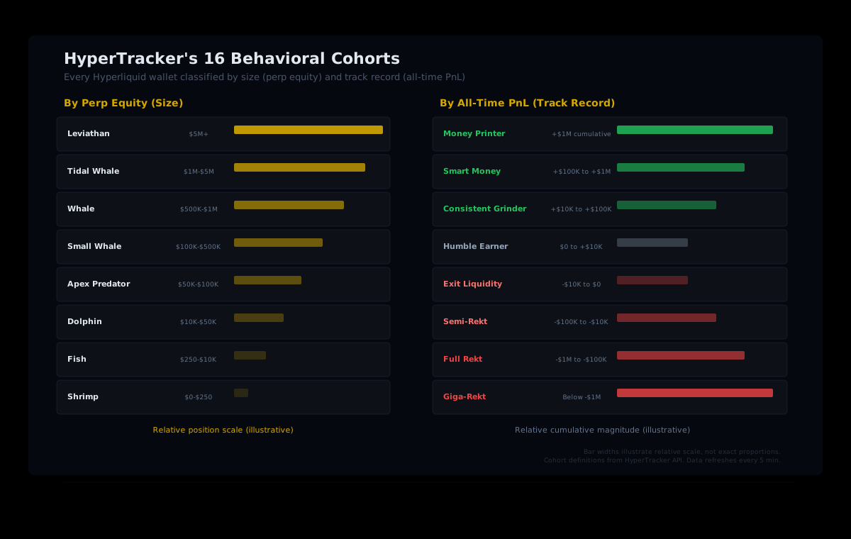
HyperTracker classifies every wallet on Hyperliquid into one of 16 behavioral cohorts, split across two dimensions: position size (perp equity) and track record (all-time PnL). That classification turns the aggregate OI number into a behavioral map.
Size cohorts
Eight segments by perp equity, ranging from Shrimp ($0 to $250) through Fish, Dolphin, Apex Predator, Small Whale, and Whale, up to Tidal Whale ($1M to $5M) and Leviathan ($5M+). Each cohort's aggregate positioning tells you where the leverage concentration sits.
PnL cohorts
Eight segments by all-time realized performance, from Money Printer (+$1M cumulative) and Smart Money (+$100K to $1M) through Consistent Grinder and Humble Earner on the positive side, down to Exit Liquidity, Semi-Rekt, Full Rekt, and Giga-Rekt (below -$1M cumulative) on the negative side.
Why both dimensions matter. A Leviathan wallet with a Money Printer track record opening a position carries different signal weight than a Fish wallet with a Giga-Rekt history opening the same trade. Size tells you scale. PnL tells you skill. Together, they tell you whether smart capital is leading the move or exit liquidity is chasing it.
When OI hits $14.3 billion, the question for any serious trader or builder is not "how much?" but "who?" Which cohorts are adding positions? Are the profitable wallets leading, or are the historically rekt wallets piling in late? Is the Leviathan segment increasing exposure, or has it been quietly trimming while smaller cohorts lever up?
These are the questions that cohort analytics answer, and they are invisible in any aggregate OI chart.
The Catalysts Behind $14.3 Billion
Two major events accelerated the OI recovery in August and September.
Coinbase Base App integration
On August 19, Coinbase began routing Base App users directly to Hyperliquid for perpetual futures trading, offering up to 50x leverage across more than 290 markets. Rather than operating its own derivatives venue, Coinbase routes orders to Hyperliquid for execution while users maintain self-custody through their Base App wallet. The integration is available internationally, excluding the US, UK, and Canada.
This is the kind of distribution event that changes market structure. Coinbase is not a minor referral source. It brings a retail funnel with millions of existing users, most of whom have never interacted with a perp DEX directly. The cohort composition after this event is likely to look different from before it, with a fresh wave of smaller wallets entering positions for the first time.
Trump signals US onshore path
In August, President Trump stated that CFTC Chair Michael Selig was working to bring Hyperliquid into the United States "in a fully compliant and legal fashion." HYPE surged on the news. The proposed arrangement would involve Kraken parent Payward and its CFTC-regulated subsidiary Bitnomial, operating a separately regulated US product built on Hyperliquid's infrastructure.
Even before any regulatory approval materializes, the signal alone shifts positioning. Institutional wallets that previously avoided Hyperliquid due to US regulatory uncertainty now have a reason to start building exposure. That kind of re-rating shows up in our cohort data before it shows up in price.
What Builders Should Watch in the Cohort Data
For builders and quants consuming HyperTracker's API, the current market structure creates specific opportunities worth monitoring through cohort endpoints.
Leverage distribution across size tiers
When OI approaches a previous high, the risk question is whether leverage is concentrated in fragile tiers. Our data segments positioning across all eight size cohorts, from Shrimp through Leviathan. If the OI growth is being driven by Leviathan and Tidal Whale wallets with moderate leverage, the structure is healthier than if Shrimp and Fish cohorts are the ones piling in at high multiples. One API call to the cohort metrics endpoint surfaces this breakdown for any asset.
PnL cohort divergence
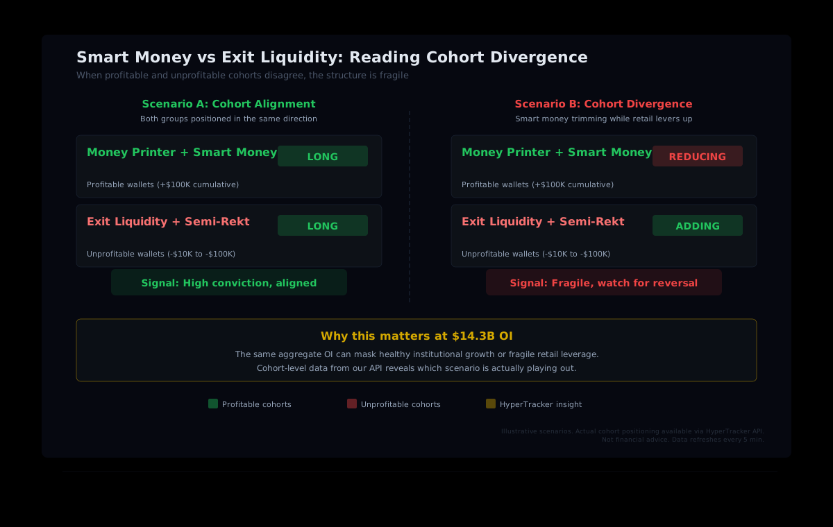
The split between Money Printer / Smart Money positioning and Exit Liquidity / Semi-Rekt positioning is one of the strongest directional signals in our data. When historically profitable wallets and historically unprofitable wallets are taking the same side of a trade, conviction is high. When they diverge, with smart money trimming while exit liquidity adds, the structure is fragile regardless of how big the OI number looks.
HIP-3 vs. core crypto rotation
The shift from HIP-3-driven OI growth to core-crypto-driven growth changes which cohorts are active. RWA perps attract a different behavioral profile than BTC and ETH majors. Monitoring the cohort mix across market types can reveal whether the rotation is bringing in new capital or just redistributing existing positions.
Revenue Tells Its Own Story
One puzzle in the data: despite record OI, Hyperliquid's revenue has been declining. Quarterly gross revenue peaked at $356.7 million in Q3 2025, then fell to $295 million in Q4, $217.5 million in Q1 2026, and $201.8 million in Q2 2026, a roughly 43% decline from peak.
The explanation lies in composition. HIP-3 markets, which drove much of the OI recovery, route a smaller percentage of fees to the protocol's Assistance Fund compared to core crypto perps. As OAK Research noted, a dollar of OI returning to core crypto perpetuals is worth materially more to HYPE than a dollar arriving through a builder-deployed market. Revenue and OI are disconnected because the fee structure differs across market types.
For traders, this creates an interesting dynamic. The protocol's buyback pressure (which has historically supported HYPE price) is a function of revenue, which depends on fee composition. The current shift back toward core crypto OI, if sustained, could reverse the revenue decline even without further OI growth.
Building With Cohort Intelligence
If you're building trading tools, risk engines, or dashboards on Hyperliquid, the current market structure is a case study in why aggregate metrics are insufficient. A dashboard that shows "$14.3B OI" tells the user one thing. A dashboard that shows which cohorts are driving that number, how leverage is distributed, and whether smart money is aligned with or diverging from retail tells the user everything they need to make a decision.
HyperTracker's API exposes this cohort-level intelligence across 16 behavioral segments, with data refreshing every 5 minutes. You can query cohort positioning, bias, and aggregate metrics for any asset on Hyperliquid, then overlay that with leaderboard rankings, liquidation risk scores, and order flow snapshots.
The infrastructure cost to build this classification layer from scratch, ingesting raw positions, computing equity tiers, matching against all-time PnL histories, maintaining historical snapshots, starts at $10,000 per month in compute and engineering time. Or you query our API for $179 per month on the Pulse tier.
See What the Cohorts Show
16 behavioral segments. Every wallet classified by size and track record. Refreshed every 5 minutes. One API call gives you the intelligence that the OI headline doesn't.
Start building with HyperTracker
Hyperliquid's open interest is back where it started before the crash. But the market underneath is not. The cohorts have shifted, the composition has rotated, and the risk profile is different. The traders who treat $14.3 billion as the same $14.7 billion from a year ago will be the ones who get caught when the structure fractures. The ones reading the cohort data will see it coming first.