
Where Bitcoin's Bulls Get Liquidated on Hyperliquid
By CMM Team - 18-Aug-2026
Where Bitcoin's Bulls Get Liquidated on Hyperliquid
Every leveraged bull position on Hyperliquid has an exact liquidation price. Not an estimate, not a model derived from aggregate open interest. An on-chain coordinate that anyone can query.
That distinction matters more than most traders realize, because the clusters those coordinates form tell you where the next cascade starts. In June 2026, Bitcoin dropped from roughly $67,000 to $59,100 in 48 hours, triggering over $3 billion in forced liquidations across crypto derivatives markets. The damage was concentrated in leveraged longs, which accounted for roughly 85% of BTC losses.
The positions that got wiped did not appear out of nowhere. They were stacked in visible clusters between $65,000 and $60,000 for weeks before the event. Anyone querying Hyperliquid's on-chain data could see the pile-up. The question was timing, and whether you were standing in the cluster or watching it from outside.
Why Hyperliquid Liquidation Data Is Different
On centralized exchanges like Binance, Bybit, and OKX, liquidation heatmaps are statistical models. No CEX publishes per-position liquidation prices, so tools estimate them based on aggregated open interest and assumed leverage distributions. The clusters can be off by wide margins.
Hyperliquid changes this equation because it runs on-chain. Every position's entry price, leverage, and margin are queryable directly, which means the liquidation price is derived from real data, not inferred from assumptions. When a heatmap tool aggregates Hyperliquid positions, the resulting clusters reflect actual notional size at specific price levels.
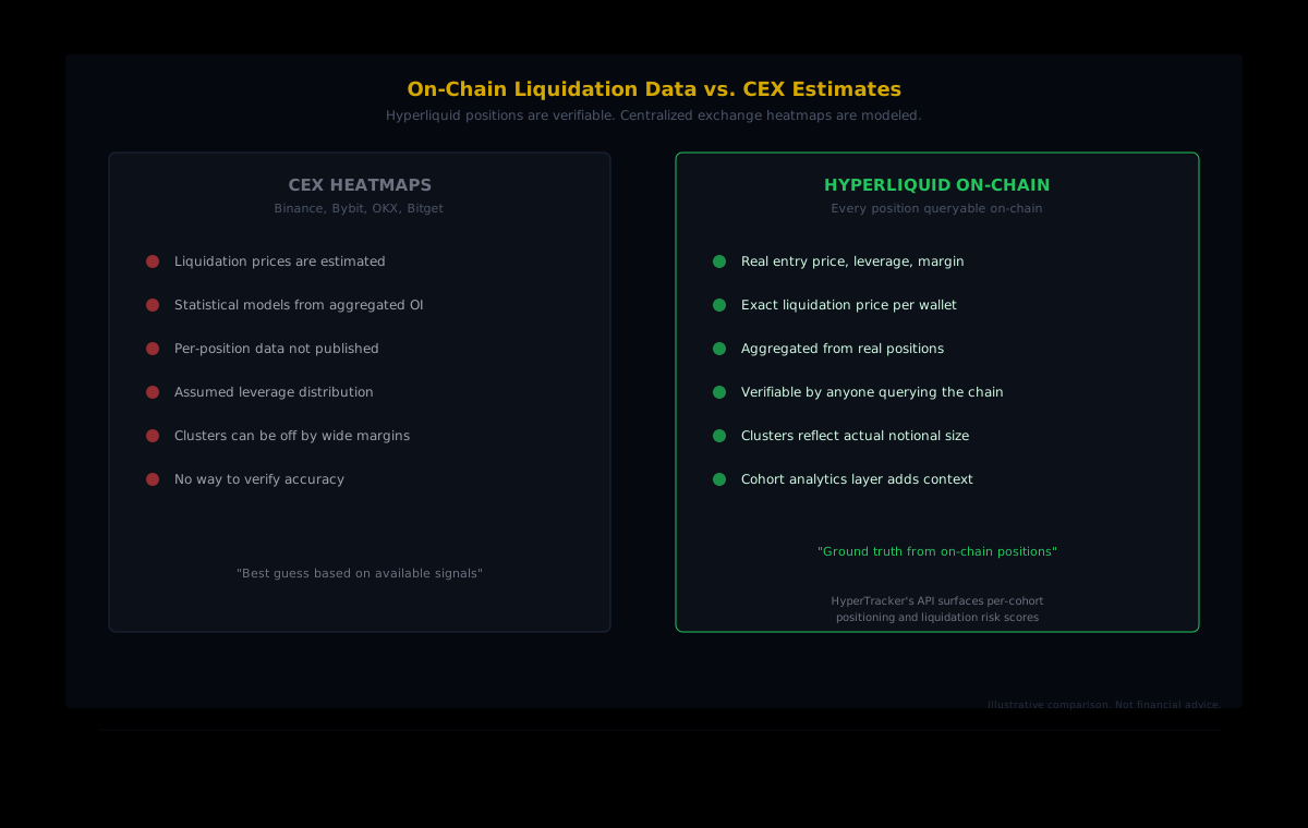
This matters for two reasons. First, you can verify the data yourself. Second, the clusters are more reliable signals for where forced selling (or buying) will actually occur. A cluster on Binance's estimated heatmap might represent a rough probability distribution. A cluster on Hyperliquid represents real wallets with real margin that will really get liquidated if price reaches that level.
The Current Setup: Shorts Outweigh Longs
As of mid-August 2026, the liquidation landscape on Hyperliquid's BTC perp shows an asymmetric setup. The short-side liquidation zone between $64,600 and $66,545 holds 3,895 BTC in total size, worth approximately $249.4 million in notional value. Below the current price, the long-side liquidation zone between $61,200 and $61,832 holds 1,547 BTC, roughly $99 million notional.
The ratio tells the story: shorts carry more than 2.5x the notional exposure of longs at these levels. That creates asymmetric squeeze potential. If Bitcoin pushes above $64,600 and starts clearing the short-liquidation cluster, forced buy-backs from those 3,895 BTC worth of shorts would amplify the move higher. The long-side clusters below are thinner, meaning downside cascades have less fuel to sustain themselves.
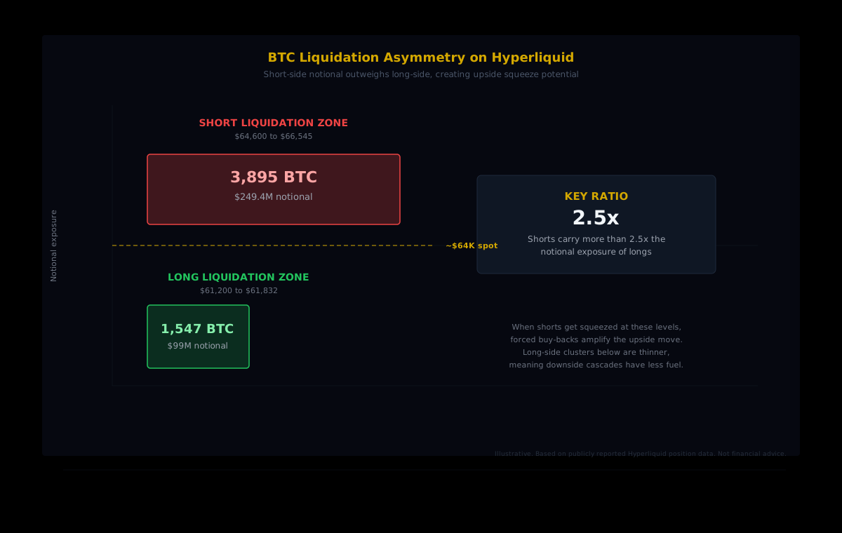
This does not guarantee an upside move. It means that from a derivatives standpoint, the infrastructure for an upside squeeze is more developed than the infrastructure for a downside flush. Price still needs a catalyst.
How Cascades Actually Work
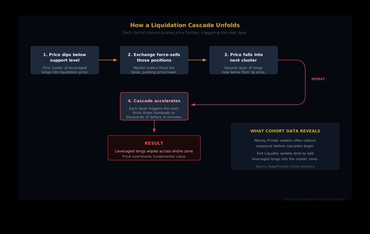
A liquidation cascade is a chain reaction. One forced closure pushes price further in the same direction, which triggers the next liquidation, which pushes price further still. The process continues until the cluster of leveraged positions at that price level is exhausted.
June 2026 demonstrated the mechanics with brutal clarity. When BTC broke below $63,000 on June 4, it punched through an entire cluster of leveraged longs that had accumulated between $65,000 and $60,000. Open interest dropped 22% in a single session. The Fear and Greed Index hit 12, deep in Extreme Fear territory.
That same pattern repeated earlier in 2026. On June 2, $1.8 billion in total crypto liquidations hit in a single day. Long positions accounted for $1.57 billion of that total, while shorts contributed $215.7 million. Some 272,000 traders were liquidated during the event.
Bitcoin alone saw $833 million in liquidations, with the largest single wipeout being a $59.67 million BTC position on HTX.
The Pattern That Keeps Repeating
2026 has been a masterclass in leverage cycles. February's "Black Sunday" events saw $2.56 billion in crypto liquidations in a single day, with longs accounting for over 90% of the damage. Before Bitcoin even reached June, open interest had climbed above $111 billion.
The cycle follows a consistent rhythm:
- Calm rebuilding. After a cascade, leverage rebuilds during periods of relative stability. Traders pile into long positions, gradually restacking the clusters that the previous cascade cleared.
- Cluster formation. As positions accumulate at similar price levels (often round numbers or key support zones), dense liquidation clusters form. These are visible on-chain weeks before they trigger.
- Catalyst and breach. A macro event, surprise data print, or even large profit-taking breaks price through the first cluster. June's cascade was amplified by 13 consecutive days of ETF outflows totaling $4.33 billion.
- Cascade and overshoot. Forced liquidations drive price through successive clusters, often overshooting fundamental value before stabilizing.
The pattern is not unique to 2026, but the transparency of Hyperliquid's on-chain data means you can watch it form in something closer to real time. You can see the clusters building, see the leverage stacking, and make informed decisions about whether your own positions are inside or outside the danger zone.
What Cohort Data Adds to the Picture
Raw liquidation clusters tell you where the risk sits. Cohort-level analytics tell you who is building that risk.
HyperTracker classifies every wallet on Hyperliquid into one of 16 behavioral cohorts, split by perp equity size and all-time PnL. On the size axis, wallets range from Shrimp ($0 to $250 in perp equity) to Leviathan ($5M+). On the PnL axis, they range from Giga-Rekt (below -$1M all-time) to Money Printer (+$1M+ all-time).
When a dense liquidation cluster forms on the BTC perp, cohort data can reveal which segments are doing the stacking. Are Money Printer wallets (the consistently profitable traders) adding to the cluster, or are they reducing exposure? Are Exit Liquidity wallets (those in the $0 to -$10K all-time PnL range) piling into leveraged longs at precisely the wrong level?
The data does not predict cascades. It shows you the composition of the risk. When the majority of a liquidation cluster comes from historically unprofitable cohorts, the cluster may be more fragile than its raw notional size suggests. When profitable cohorts are building positions at the same levels, the conviction signal is stronger.
This layer of context is what separates a basic heatmap from actionable intelligence. The heatmap says "there is a $99M cluster here." Cohort analytics say "and here is who built it."
Reading the Zones Before the Next Catalyst
Bitcoin is trading near $64,000 as of mid-August 2026, still well below its October 2025 high near $126,000. The market sits in a zone of concentrated leverage on both sides, but the balance favors short-side exposure above current price.
For builders and traders working with on-chain liquidation data, the practical framework is straightforward:
- Map the clusters. Query Hyperliquid's on-chain positions to find where liquidation prices concentrate. The largest clusters represent the highest cascade risk, on both sides.
- Assess the composition. Use cohort-level data to understand whether the cluster is built by consistently profitable wallets or by wallets with a history of getting liquidated. The composition affects how the cluster will behave under pressure.
- Watch the catalysts. Macro data prints (like CPI, which was due August 12), ETF flow reversals, and large on-chain movements from entities like Mt. Gox (which moved 10,422 BTC before June's cascade) can provide the trigger. The clusters are the fuel. The catalyst lights it.
- Monitor cluster changes. Liquidation clusters are not static. As traders open and close positions, the clusters shift. A dense cluster today can thin out over a few days if positions get closed voluntarily. Regular monitoring catches these shifts.
Building Liquidation Monitoring with Our API
HyperTracker's API gives you programmatic access to the positioning data that makes this analysis possible. The /cohort-metrics endpoint returns segment-level positioning for all 16 cohorts, while /liquidation-risk surfaces asset-level liquidation exposure scores. Our data refreshes every 5 minutes with rolling snapshots, and Flow-tier subscribers ($799/mo) can receive push updates via webhooks when positioning shifts cross configurable thresholds.
Build Liquidation Intelligence Into Your Stack
HyperTracker's API surfaces cohort-level positioning, liquidation risk scores, and smart money analytics for every Hyperliquid perp. Sixteen behavioral cohorts, one API call, and data that refreshes every 5 minutes. Start with the free tier (100 requests/day) or go straight to Pulse at $179/mo for full access.
The leveraged long liquidation clusters on Hyperliquid are not mysteries. They are coordinates, visible on-chain, measurable by cohort, and historically explosive. The traders who got swept in June's cascade were standing in a cluster that had been forming for weeks. The question, now as then, is whether you are watching the cluster or standing in it.