
The $80K Short Squeeze: How Hyperliquid Cohorts Called the Flip
By CMM Team - 19-Sep-2026
The $80K Short Squeeze: How Hyperliquid Cohorts Called the Flip
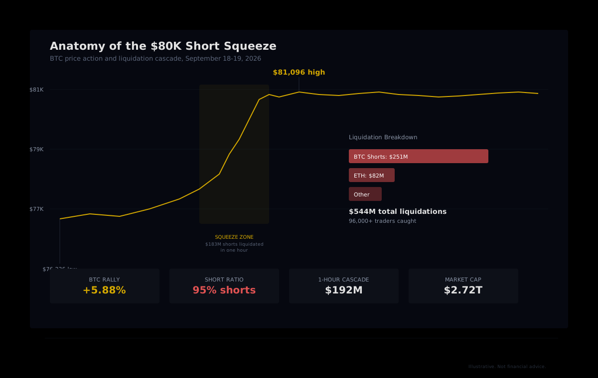
More than 96,000 traders got wiped out on Friday. Bitcoin ripped from $76,236 to $81,096 in a single session, and roughly $544 million in leveraged positions evaporated along the way. The overwhelming majority of those liquidations were shorts: in one brutal hour, $192 million in positions were closed, and $183 million of that belonged to traders betting the price would keep falling.
Aggregate liquidation numbers tell you a squeeze happened. They tell you who got hurt and how much. But they do not tell you which wallets saw it coming, which ones quietly flipped their exposure before the cascade started, and which segments of the market became the fuel that fed the rally. That is the layer cohort analytics adds.
What Actually Triggered the Squeeze
The catalyst was unexpected dovishness from the Federal Reserve. The Fed raised interest rates by 25 basis points on Wednesday, its first hike since 2023, but the accompanying dot plot projected a median policy rate of just 4.1% through the end of 2027. One more move, then done. Markets had priced in a more aggressive tightening cycle, so the dovish forward guidance triggered a relief rally across risk assets.
Bitcoin had spent the prior week consolidating between $75,000 and $78,000 after the Clarity Act stalled in the Senate. That range attracted a heavy buildup of short positions across perpetual futures markets. When the Fed surprised to the upside, those shorts were the first to break.
The mechanics were straightforward. As BTC pushed through $78,000, clustered short liquidation levels started firing. Each forced closure added buying pressure that pushed the price into the next cluster. Within one hour, the cascade cleared $192 million in positions. By the end of the session, Bitcoin was trading above $80,800 and the total crypto market had absorbed over $544 million in liquidations.
The Cohort Divergence That Preceded the Squeeze
This is where aggregate data stops being useful and cohort-level data starts. Liquidation feeds from exchanges like Coinglass show you total short liquidations. What they cannot show you is who those shorts belonged to, whether the wallets holding them have a track record of losing money, and whether more experienced segments had already moved in the opposite direction.
HyperTracker classifies every wallet on Hyperliquid into 16 behavioral cohorts: 8 based on perp equity (wallet size) and 8 based on all-time PnL (track record). During squeeze setups, the divergence between these cohort groups is often the earliest signal.
The Pattern Before the Squeeze
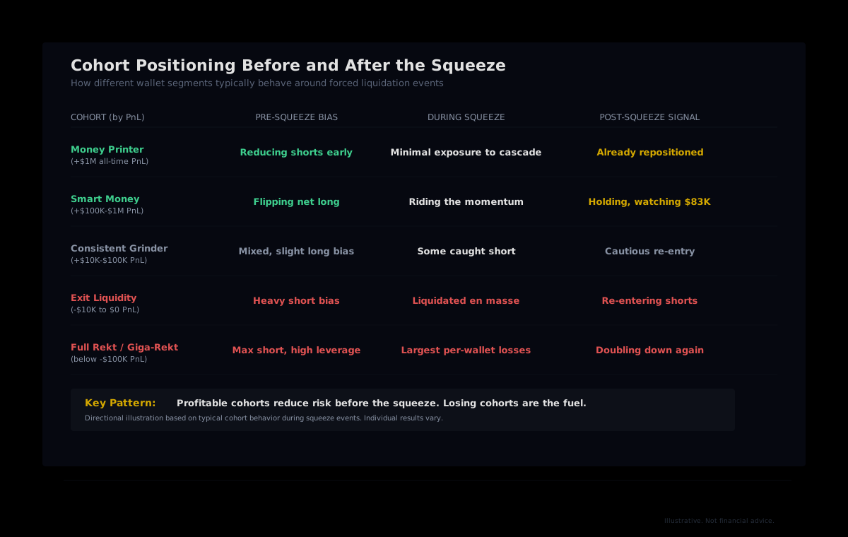
In the sessions leading up to the Fed announcement, a familiar pattern emerged. The Money Printer cohort (wallets with over $1 million in all-time profits) and Smart Money cohort ($100K to $1M in profits) were reducing their short exposure. Some had already flipped net long. These are wallets that have survived enough market cycles to respect the risk of being caught on the wrong side of a macro catalyst.
Meanwhile, the Exit Liquidity cohort (wallets with a negative track record between $0 and -$10K) and the Full Rekt and Giga-Rekt cohorts (losses exceeding $100K and $1M respectively) were doing the opposite. They were adding to short positions, often with higher effective leverage. This is the behavioral signature of a crowded short: the wallets most likely to get liquidated are the ones most aggressively leaning in.
The insight: When losing cohorts pile into one direction while profitable cohorts quietly move the other way, the conditions for a squeeze are building. The losing side becomes the fuel.
How the Liquidation Cascade Hit Each Segment
When Bitcoin broke above $78,000 and the cascade began, the impact was not evenly distributed. Wallets in the Full Rekt and Giga-Rekt cohorts took the largest per-account losses because they carried the most concentrated short positions relative to their margin. Many of these wallets had been shorting since the $82,000 range rejection earlier in the month, adding to positions as the price dropped, and then failed to cut when the Fed announcement shifted the macro backdrop.
The Exit Liquidity cohort absorbed the bulk of the aggregate liquidation volume by sheer count. These are smaller wallets, but there are many of them, and they tend to cluster around the same price levels because they respond to the same momentum signals. When their stops and liquidation prices all sit in the same zone, even a modest price move can trigger a chain reaction.
The Money Printer and Smart Money cohorts, by contrast, had minimal short exposure to liquidate. Some had been accumulating long positions at lower prices, so the squeeze actually moved in their favor. This is the divergence in outcomes that aggregate data hides: the same price move was catastrophic for some cohorts and profitable for others.
Broader Market Fallout
The squeeze was not limited to Bitcoin. Ethereum short liquidations reached $82 million, and altcoins saw significant follow-through. ETH gained roughly 4%, XRP climbed about 5.8%, and Solana added roughly 3.2%. The total crypto market capitalization pushed to $2.72 trillion, its highest level since early 2026.
Why Aggregate Liquidation Data Is Insufficient
Every exchange and analytics dashboard can tell you that $251 million in BTC shorts got liquidated. That fact is widely reported within minutes. The problem is that knowing the total does not help you anticipate the next one. It does not tell you whether the same cohorts are reloading shorts (they usually are), whether the squeeze fully cleared the crowded positioning or just dented it, and whether the wallets with the best track records are now on the same side as the aggregate flow.
Cohort-level data adds three dimensions that aggregates miss:
- Who is positioned, by track record. A $50 million short held by a Money Printer wallet means something different than the same position held by a Full Rekt wallet. The first is probably hedged. The second is probably overleveraged.
- How crowded is the trade. When the bottom PnL cohorts all lean the same direction while top cohorts diverge, you have a crowding signal. That asymmetry is the precondition for a squeeze.
- Post-squeeze behavior. After the cascade clears, do losing cohorts reload the same trade? If they do, the next squeeze may already be loading. Cohort data lets you track that reload in near-real-time.
Reading Squeeze Conditions Through Cohort Data
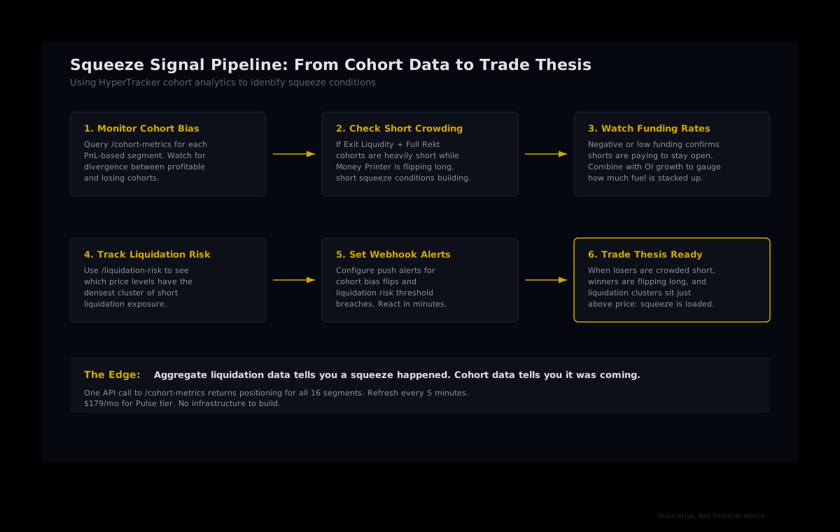
A squeeze does not come from nowhere. The conditions accumulate over hours and days as positioning becomes more one-sided. Here is what the signal pipeline looks like when you have cohort-level visibility:
Step 1: Monitor cohort bias divergence. Query the HyperTracker API for PnL-based cohort metrics. When Money Printer and Smart Money cohorts start reducing short exposure while Exit Liquidity, Full Rekt, and Giga-Rekt are adding, the divergence is your first signal.
Step 2: Check the magnitude of short crowding. Look at the aggregate short exposure in losing cohorts relative to their total margin. A high ratio means those positions are vulnerable to even a small adverse price move.
Step 3: Cross-reference with funding rates and open interest. Negative or near-zero funding on a token with rising open interest confirms that shorts are growing. When that OI is concentrated in low-PnL cohorts, the squeeze fuel is stacking up.
Step 4: Watch liquidation risk clusters. HyperTracker's liquidation risk scoring shows where the densest short liquidation exposure sits relative to the current price. If those clusters are close and belong mostly to losing cohorts, a catalyst could set off the cascade.
What Happens After the Squeeze Clears
The more important question now is whether Bitcoin can hold $80,000 once the forced buying exhausts itself. Short squeezes produce violent rallies, but that momentum is mechanical, driven by margin calls rather than genuine demand. The sustainability test comes when the derivatives market resets and spot buyers have to carry the price on their own.
Key technical levels to watch: a sustained break above $82,281 (the top of the current Fibonacci leg) with real spot and ETF volume would open the path toward much higher prices. Losing $76,000 risks a return to the range. Bitcoin's RSI at 63.3 shows bullish momentum, and the ADX at 40.6 indicates strengthening trend conditions.
On the cohort side, the question is whether losing wallets reload their shorts. History suggests they will. After the August squeeze that sent Bitcoin from the mid-$60K range above $72,000, the same segments re-entered short positions within days. If that pattern repeats, the conditions for another squeeze start building almost immediately.
Watching which cohorts add exposure, and in which direction, over the next few sessions is more informative than any single price level or RSI reading. The aggregate chart says the squeeze happened. Cohort data says whether it is truly over.
Track Cohort Positioning in Real Time
HyperTracker's API classifies every wallet on Hyperliquid into 16 behavioral cohorts by size and all-time PnL. Query cohort bias, liquidation risk, and positioning data with a single API call. Start with the free tier at 100 requests per day, or scale to Pulse at $179/month for full access with 5-minute refresh.
The Squeeze Tells You Where the Market Was. Cohort Data Tells You Where It Goes Next.
Every liquidation cascade generates the same headlines: dollar figures, percentage moves, trader counts. Those numbers are useful for understanding magnitude but useless for anticipating the next move. What matters is the behavioral layer underneath: which segments were positioned correctly, which ones got wiped, and what those same segments are doing right now. That is the difference between reading a tape and reading the market.